2.2 Exploratory Data Analysis
Key insights from the exploratory data analysis are shown below. The detailed analysis can be studied online in the corresponding Jupyter notebook 3_EDA.ipynb4.
2.2.1 Data Types
An analysis of the data set dictionary (Appendix B.2) reveals the following data types:
- Index: CONTROLN, unique record identifier
- Dates: 73 features in
yymmformat. - Binary: 48 features
- Categorical: 46 features
- Numeric: 309
The data types present after import with the python package pandas’ read_csv() are shown in Table 2.1. Two things are worth noting: There are many integer features, meaning that most numeric data is discrete. Few categorical features and no date features were automatically identified. The missed categoricals and dates are most likely in the group of Object features, which is pandas’ catch-all type, and will have to be transformed during preprocessing.
| Data content | Number of features | |
|---|---|---|
| Integer | Discrete features, no missing values | 297 |
| Float | Continuous features and discrete features with missing values | 48 |
| Categorical | Nominal and ordinal features | 24 |
| Object | Features with alphanumeric values | 109 |
| Total | 478 |
2.2.2 Targets
Of the two targets, one is binary (\(\text{TARGET}_B\)), the other continuous (TARGET_D). The former is a binary response indicator for the current promotion. The latter represents the dollar amount donated in response to the current promotion and is 0.0 $ in case of non-response.
As can be seen in Figure 2.1, the response rate is 5.1 %. This means the binary target is highly imbalanced. Extra care will have to be taken during model training to obtain a model with a low generalization error.
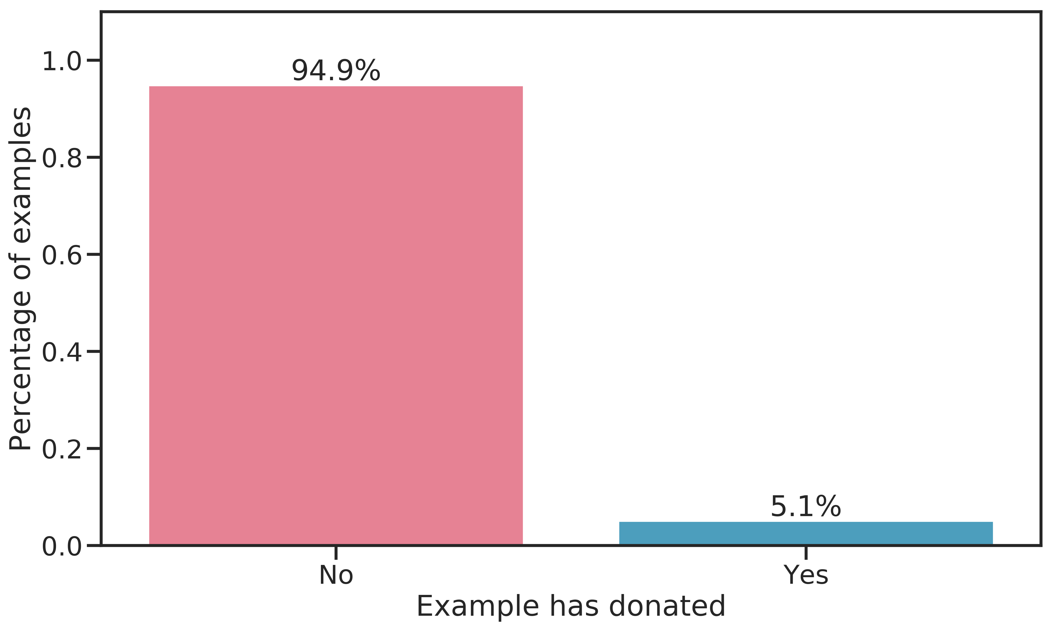
Figure 2.1: Distribution of the binary target \(\text{TARGET}_B\).
The distribution of the continuous target for \(\text{TARGET}_D > 0.0\) $ is shown in Figure 2.2. Evidently, most donations are smaller than 25 $, the 50-percentile lying at 13 $ and the mean at 15.62 $. There are a few outliers for donations above 100 $, making the distribution right-skewed. Being monetary amounts, the observed values are discrete rather than strictly continuous.
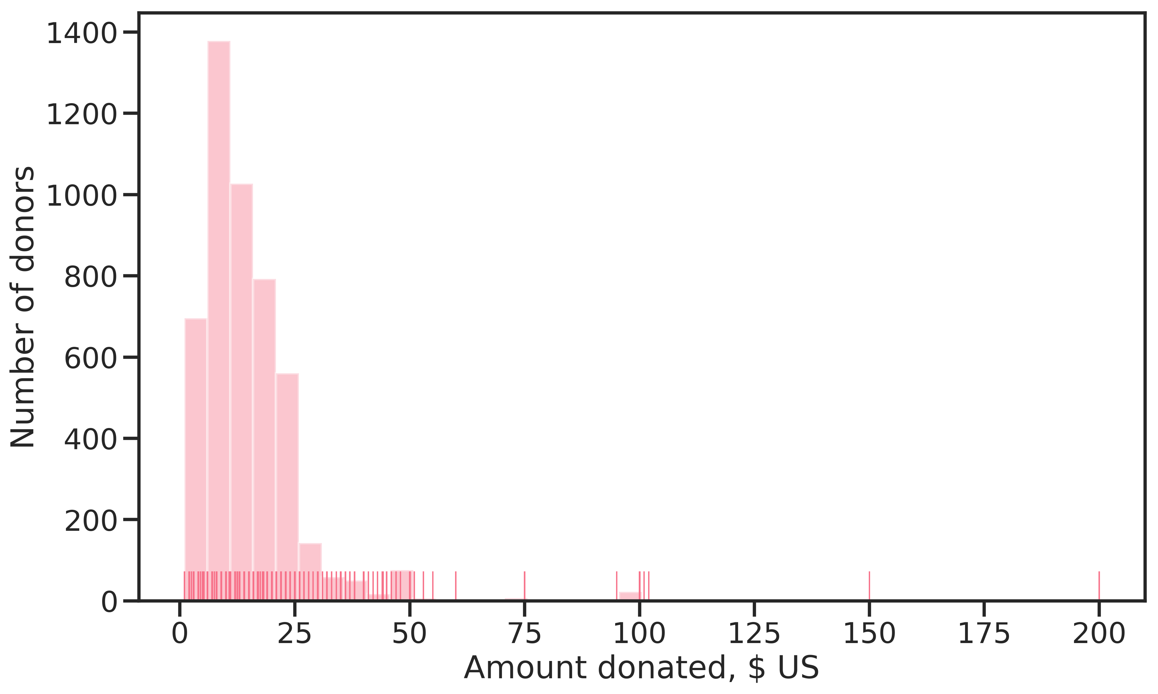
Figure 2.2: Distribution of \(\text{TARGET}_D\), the donation amount in $ US (only amounts > 0.0 $ are shown).
2.2.3 Skewness
Most of the numerical features are skewed. Due to the high dimensionality, individual assessment of the features through boxplots or histograms was not feasible. Instead, skewness was measured with the Fisher-Pearson standardized moment coefficient \(G_1 = \frac{\sqrt{n(n-1)}}{n-2} \frac{1}{n} \frac{\sum_{i=1}^n (x_i-\bar{x})^3}{s^3}\) and plotted together with the \(\alpha=5 \%\) confidence bound (CB) for a normal distribution (see Figure 2.3). Since G1 is symmetric around zero, absolute values were chosen to display the results on a log scale. Evidently, no feature was found to be strictly normally distributed.
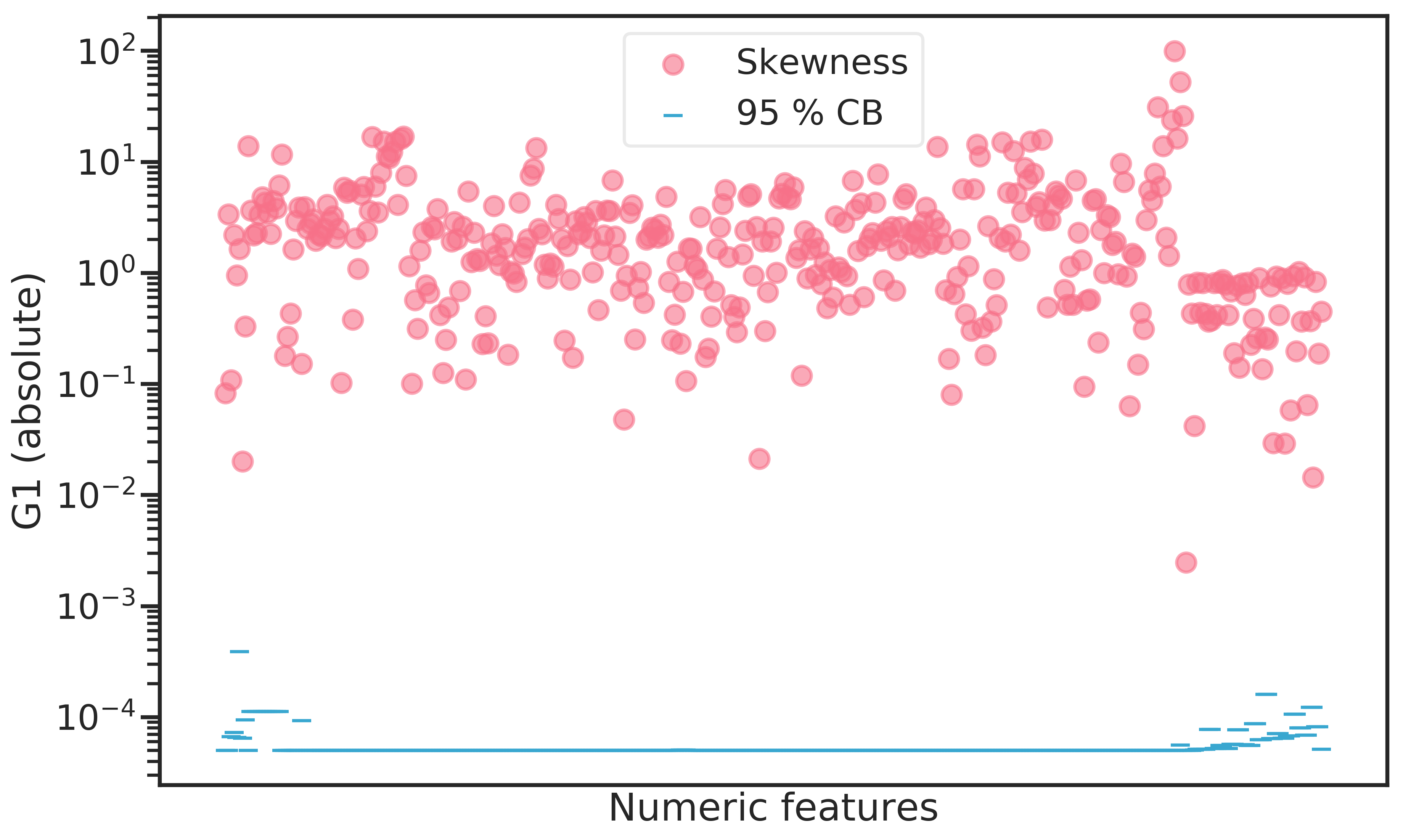
Figure 2.3: Fisher-Pearson standardized moment coefficient (G1) for all numeric features contained in the dataset. The confidence bound indicates the \(\alpha = 5 \%\) bound for the skewness of a normal distribution for any given feature.
Figure 2.4: Least skewed features by G1 (adjusted Fisher-Pearson standardized moment coefficient).
The 6 most skewed features (Figure 2.5) show heavily right-skewed poisson-like distributions which are the result of outliers.
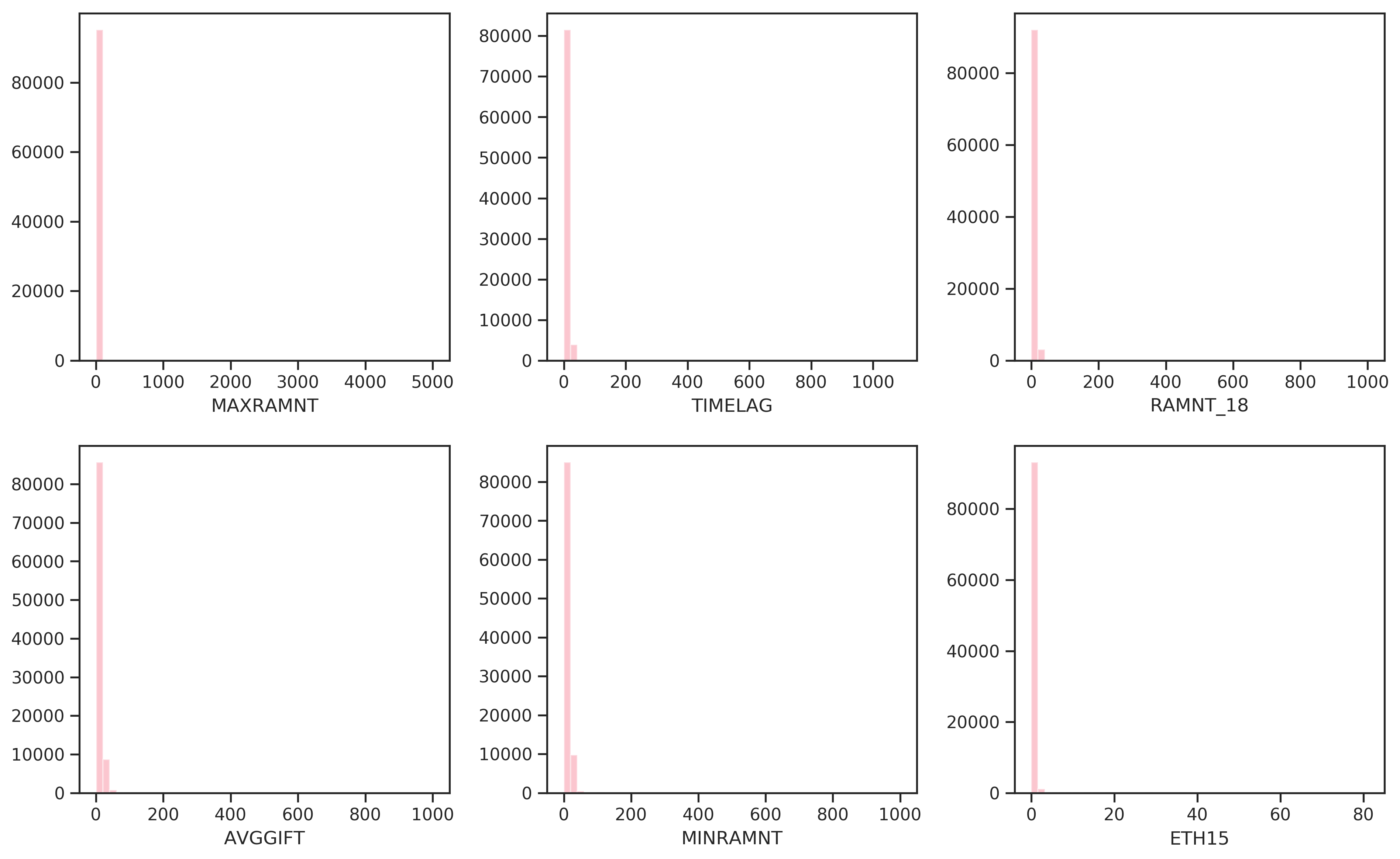
Figure 2.5: Most skewed features by G1 (adjusted Fisher-Pearson standardized moment coefficient).
2.2.4 Correlations
The high dimensionality makes it hard to assess correlations in the data between individual features. A heatmap (see Figure 2.6) provides a high-level view. From left to right, three regions can be distinguished: First, there are member database features, followed by a large center region comprised of the U.S. census features, and rightmost, there are promotion and giving history features. Between these blocks, only few features are correlated. Within each block however, there is quite strongly correlated data.
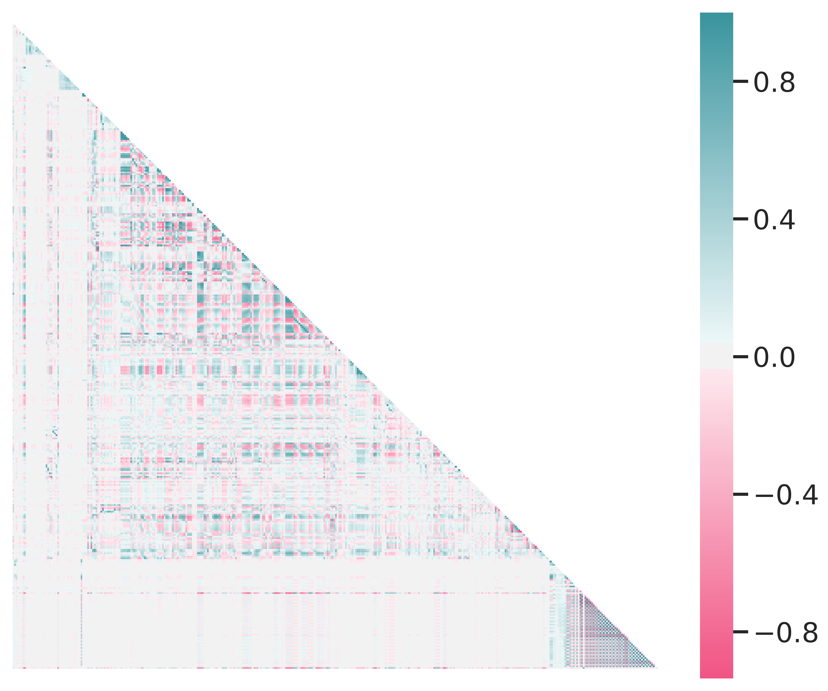
Figure 2.6: Heatmap of feature correlations. Green means positive correlation, magenta means negative correlation. Perfect correlation occurs at 1.0 and -1.0.
2.2.5 Donation Patterns
When looking at the all-time recency-frequency-amount (RFA) features for donors (Figure 2.7), no clear trend is visible to discern current donors from non-donors. Current donors are found across the whole range of recency values, although slightly concentrated at the lower end (low recency is better). A slight correlation between frequency and current donation status is also discernible: Current donors tend to “float” on top of the “sedimented” non-donors. Those examples with the highest yearly donation amount did not donate in the current promotion.
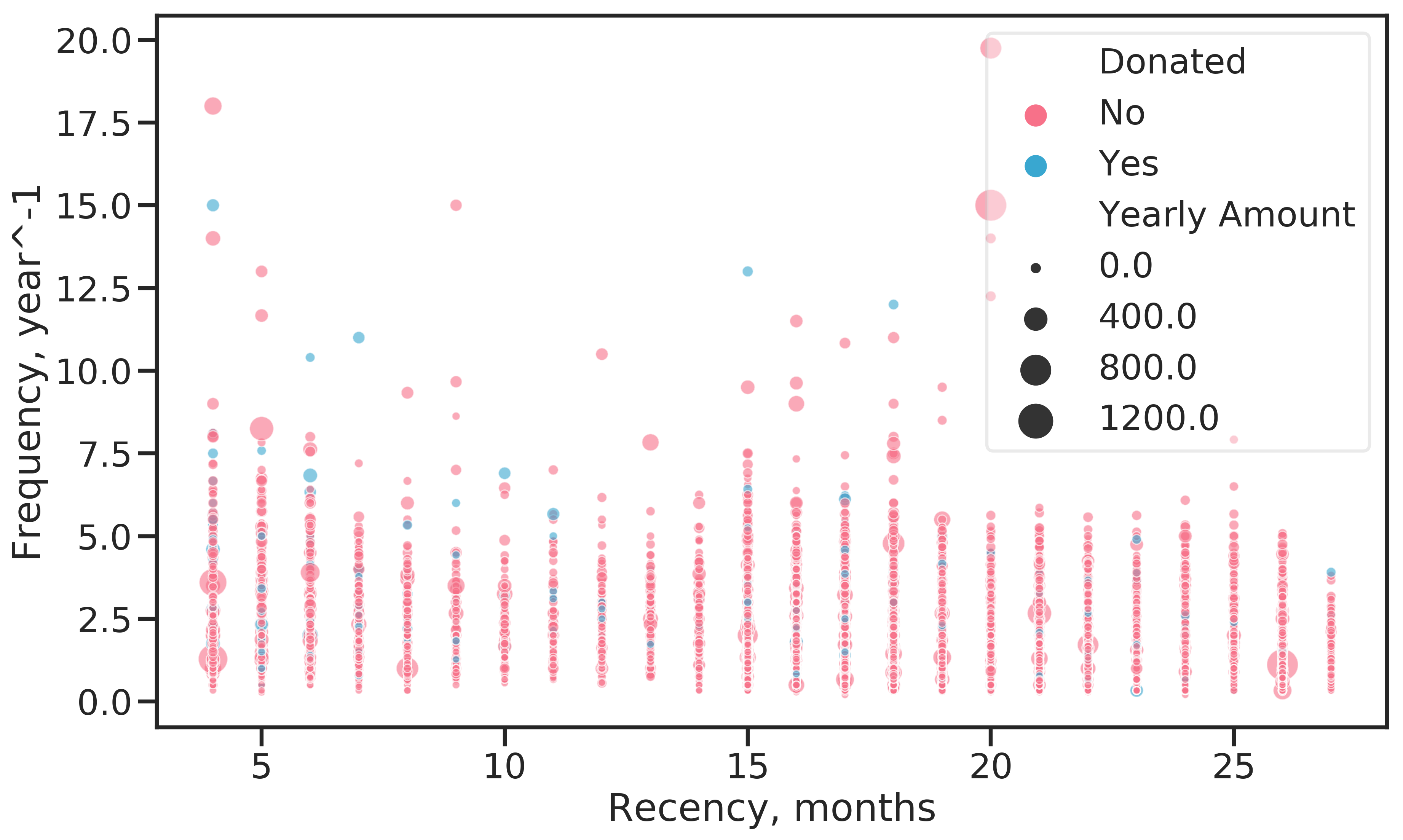
Figure 2.7: Analysis of all-time RFA values by response to current promotion. Recency is the time in months since the last donation, Frequency the average number of donations per year and Amount the average yearly donation amount.
The data set documentation states that donation amounts are positively correlated with recency, the time since the last donation. This means that the longer an example goes without donating, the higher the donation amount if it can be enticed into donating again. Figure (2.8) gives some evidence for this assumption. Starting from 15 months, the number of donations above 50 $ increase.
There is another insight gained when considering the number of donations an example has made, indicated by the point size, and donation amount: Frequent donors give relatively small sums, while the largest donations come from examples who rarely donate.
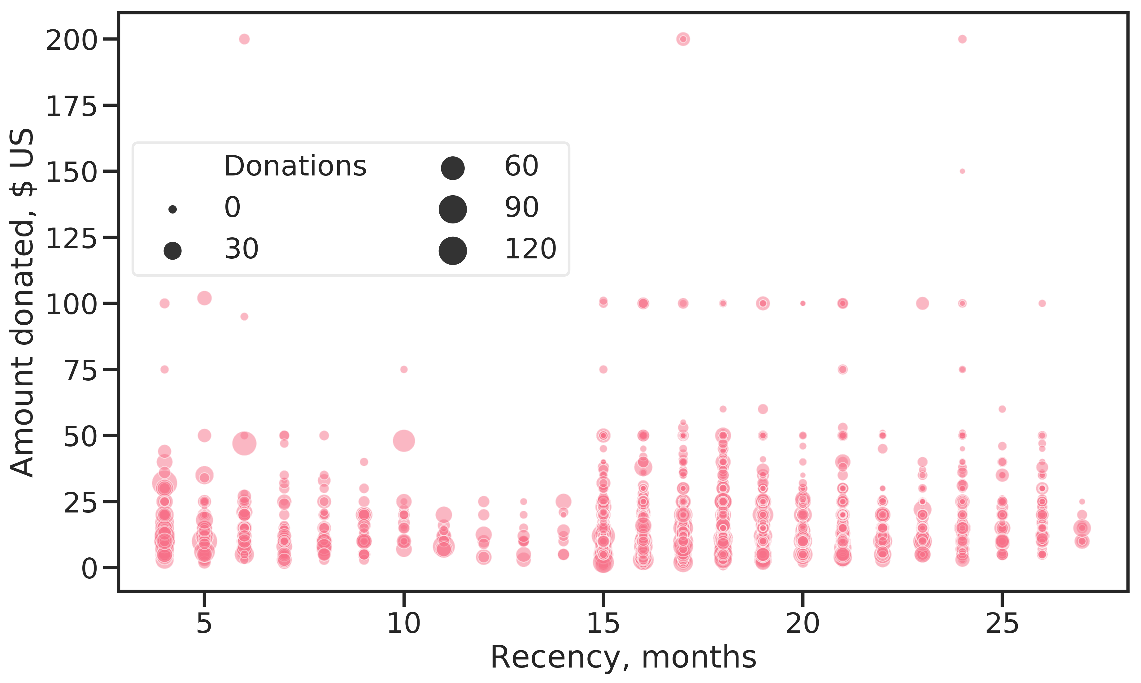
Figure 2.8: Donation amount for the current promotion against months since last donation. The dot size indicates the number of times an example has donated.
There are many examples who donated within the last 12 months prior to the current promotion ( Figures 2.7 and 2.8). This is a surprising observation. The data set should contain lapsed donors only, so there should be no donations recorded for that period. An explanation could be that the recency status is considered strictly for direct responses to promotions. Examples who donate regularly (i.e. monthly, yearly), irrespective of the promotions mailed out, would not be evaluated in terms of RFA under that assumption.
The data contains RFA features for each of the 24 promotions in the promotion history data, giving example’s status per a given promotion. Considering the RFA features for the current promotion, the insights above can be supported. Since the data set contains only lapsed donors, the recency feature is constant and not of interest (it is a nominal feature, lapsed being one of the levels). Regarding the frequency of donations (number of donations 13 - 24 months prior to the promotion), shown in Figure 2.9, a clear trend is apparent. With increasing donation frequency, donation amounts decrease.
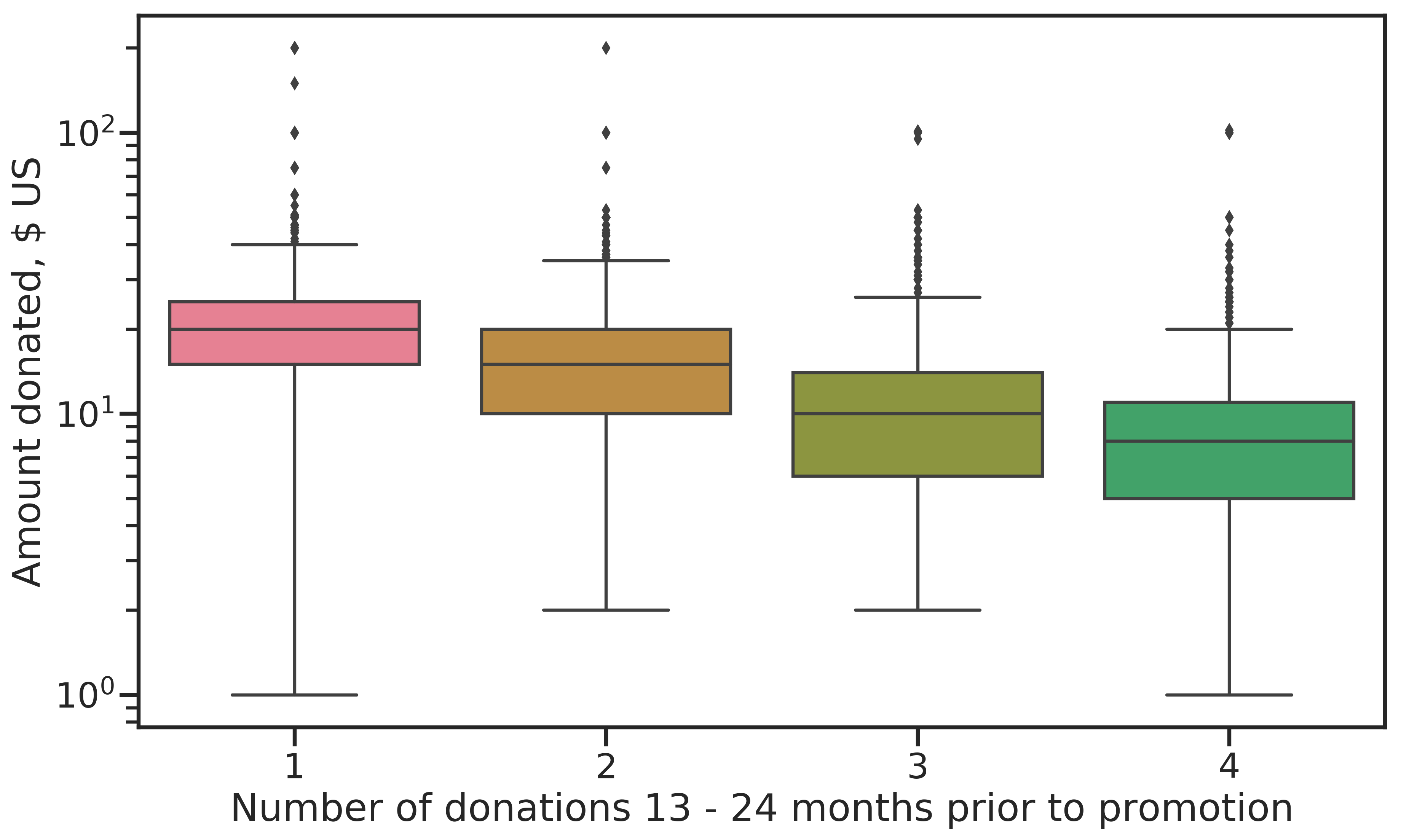
Figure 2.9: Frequency of donations in the 13-24 months prior to current promotion against amount donated. Frequent donors give smaller amounts.
Figure 2.10 shows the geographical distribution of donations. The large urban centers like San Francisco, Los Angeles, Miami, Chicago and Detroit are clearly visible. To a lesser extent, cities like Houston, Dallas, Minneapolis, Atlanta, Tampa, Seattle and Phoenix can be made out. Examples living there give small amounts. Big donors (large total donations with a high average) can be made out in rural areas in the mid-west and Texas. Interestingly, only very few donations come from the north-eastern states.
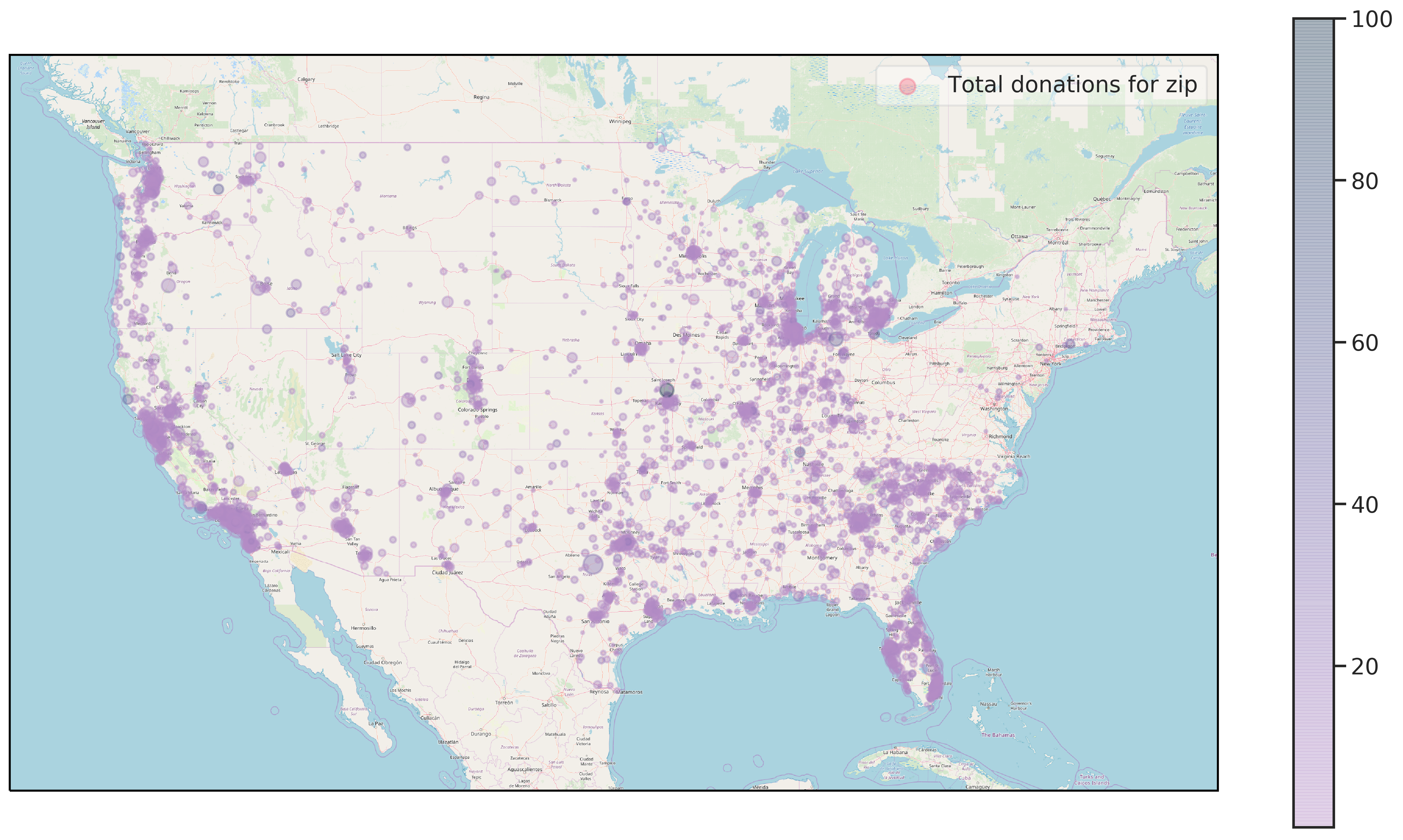
Figure 2.10: Geographical distribution of donations by zip code. Point size indicates total donations for a zip code while the hue shows average donation amount.
Examples living in rural areas tend to donate larger sums, as Figure 2.11 shows. Shown are the living environments in progressively more rural settings against the average all-time donation amount per capita.
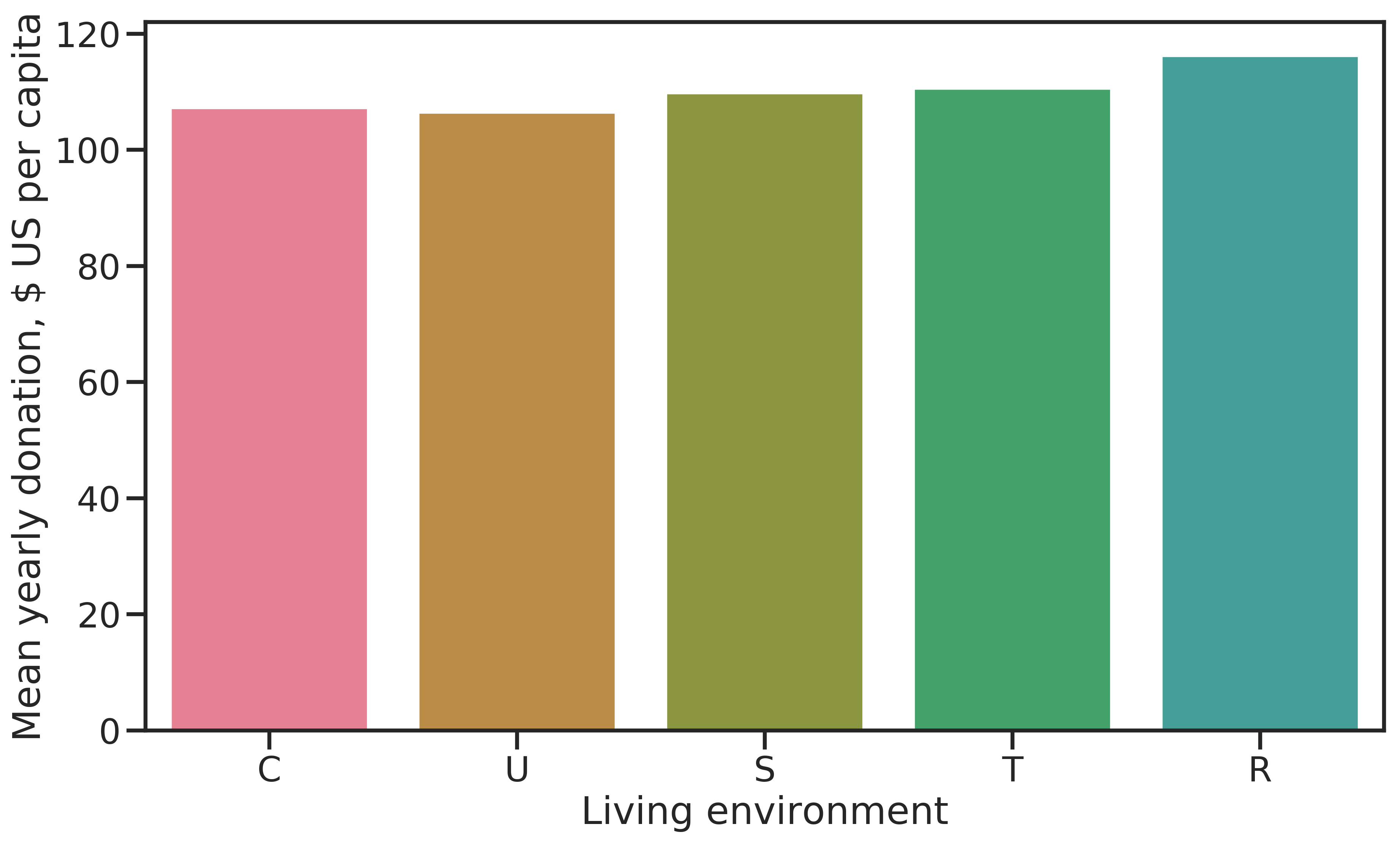
Figure 2.11: Average cumulative donation amount per capita by living environment (C = city, U = urban, S = suburban, T = town, R = rural). The more rural, the higher the average donations.
Socio-economic status by living environment reveals that examples with the highest status are rarely among the low-dollar donors. The median donation amount for the highest status is always higher than other status groups, but examples in the lowest status donate more than those in the medium level (Figure 2.12). The highest donations come from the medium status group.
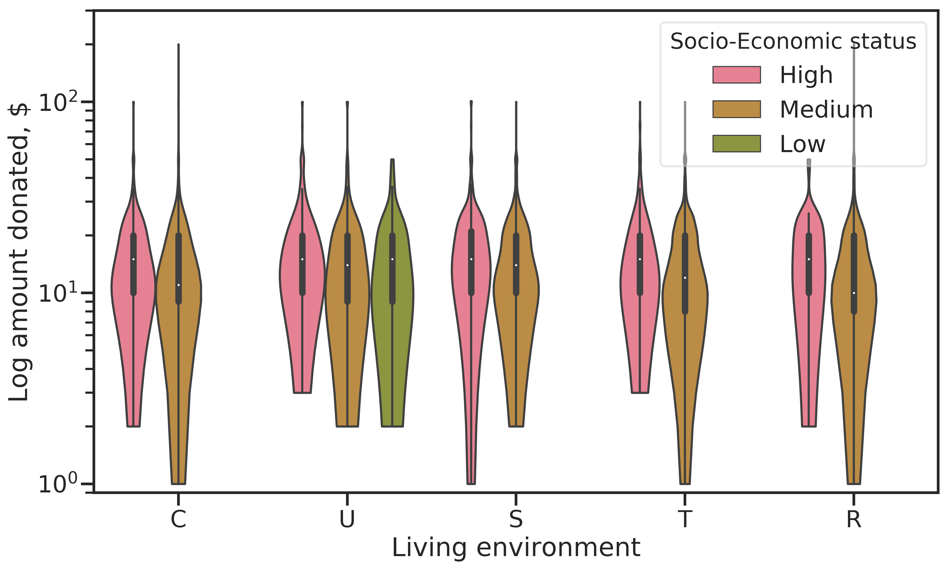
Figure 2.12: Donation amount for current promotion by living environment and socio-economic status of examples. The violin plot shows the distribution of values similar to a kernel density estimation. Median values are indicated by white dots, the bold regions give the inner quartile range.